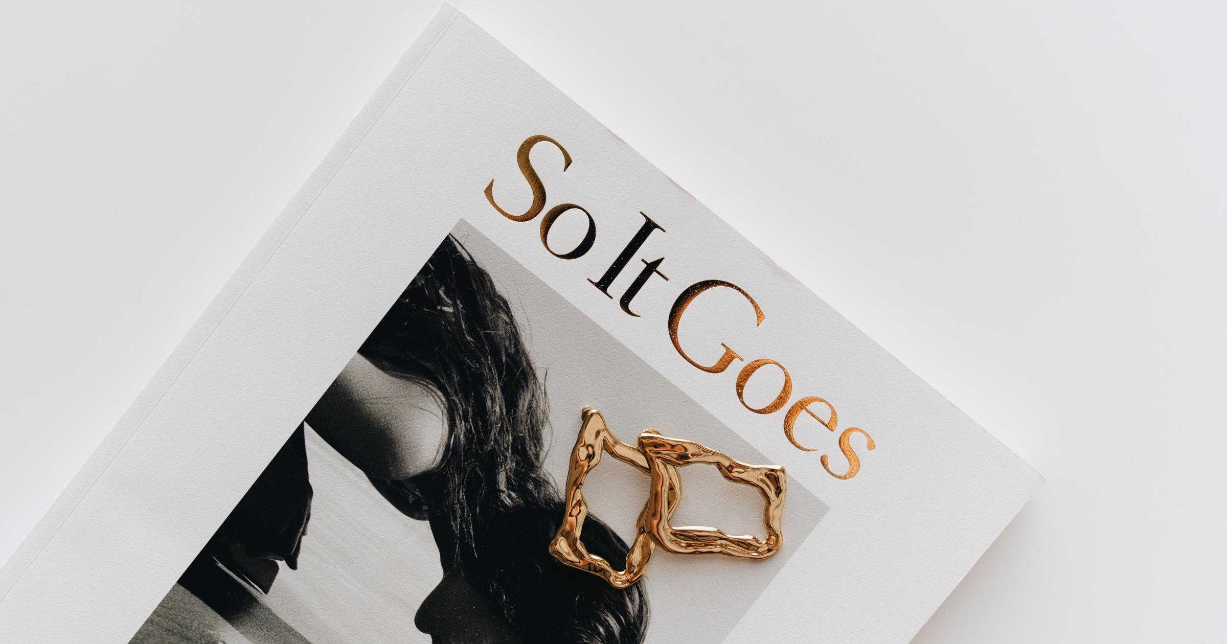
As a writer, you’ve probably dreamed of having your book published and on store shelves. But getting your work in front of the readers you want to reach is only part of the journey. The other part is making sure your book has the best chance of being seen by the right readers. One of the most important parts of making your book as successful as possible is the cover page.
We know, cover page is the first thing a potential reader sees. It is the first impression of the book that determines whether the reader picks up the book or not. A Cover page acts is a visual representation of a book and a selling tool to attract the attention of the reader. It is important that the cover page of the book is designed to appeal to the reader’s eye. So, folks, It is important to think through before finalizing your cover page design as it is important your cover page connects to its prospective readers.
There are a lot of different ways to design a book cover, but the one that’s right for your book will depend on a number of factors. The most important one is the category or genre of your book. This can help readers know what to expect inside the book and whether they’ll like it or not. For example, if your book is a romance novel, you’ll want a romance book cover. If it’s a self-help book, you’ll want a neutral book cover. A book on weight loss might have a weight loss cover page, while a book on poetry might have a poetry cover page. We can also categorize them by their design features i.e. color scheme or by visual representations i.e abstract vs realistic. When you’re thinking of a color scheme or visual representation, you might be tempted to start with what you personally find appealing. However, research shows that the majority of people prefer images of things that they’ve seen before. So, the thing to do is start with something that’s familiar and try to make it more interesting. The “Neutral” palette is a great choice for visualizing things like values, money, happiness, or mood. The “Nurture” palette is a good choice for things like pets, babies, and plants. .If you’re more creatively inclined, you could use the “Peace” palette for things like landscapes. , nature, and still-lifes.
A right cover page sets the tone for the rest of the book. The right cover page can make all the difference in whether someone buys your book or passes it by. It’s important to know which parts of the cover page are most important, so you can make the best choice for your book. A book cover page is a visual representation of the story and the written content, a book’s overall summary. The purpose is to sell the book through the impression it leaves on the reader.
It’s is important to know when to leave well enough alone. Sometimes, a book cover is best when it sticks to the classic cover page. Other times, a book cover is best when it takes a risk. It all depends on the book and what best represents it. Designers have always been trying to find different ways on how to create a good book cover design. They are not just trying to make it look appealing, but also search for ways that can make it more readable for readers and make them want to buy the book. The main goal is to evaluate what covers work best in order for readers to want to buy a book with their eyes, without any other information about its content or author.
It’s also important to know when to trust your gut and when to go with what’s popular. The cover page of a book is certainly important, but it’s not the be-all and end-all when it comes to making your book a success. There’s a lot more to it than that. In the end, the success of your book depends on a lot of other factors as well!
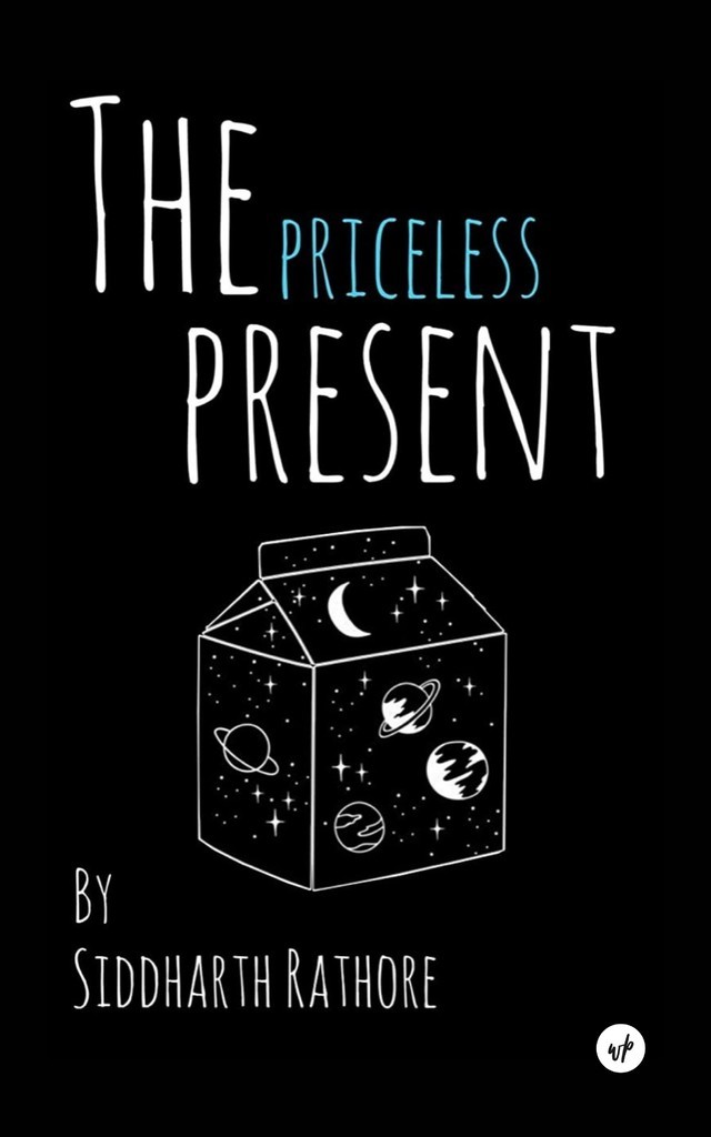
Few of my favourite book covers are:


